Hi guys,
I’m about 1/2 way through my first tattoo (1/2 sleeve), something I always wanted from when I was 16 (now 23, so I really did think it through and didn’t rush into it) and I would love o get some honest feedback from people that obviously know more than I do.
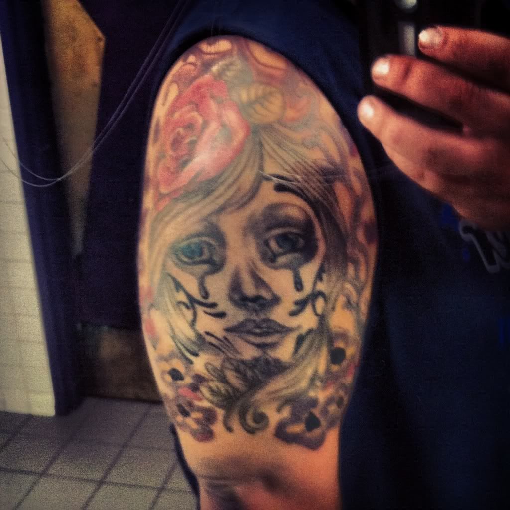
I come from an area where tattoos are generally gang related or to make people seem more “hard core”. Something I really didnt want to come across on my ink, I wanted it to be something beautiful and passionate.
Really scared for next sitting where I am going to do the inside of my arm!
So far I have about 10 hours on there (I know it doesn’t look it, but I have massive arms)
Thanks guys!!
congrats on diving in with half sleeve,
is it water at the top?
what are the heavy black spots in flower down low?
is he finished her hair?
yes, those are fat guns, we should do arms together
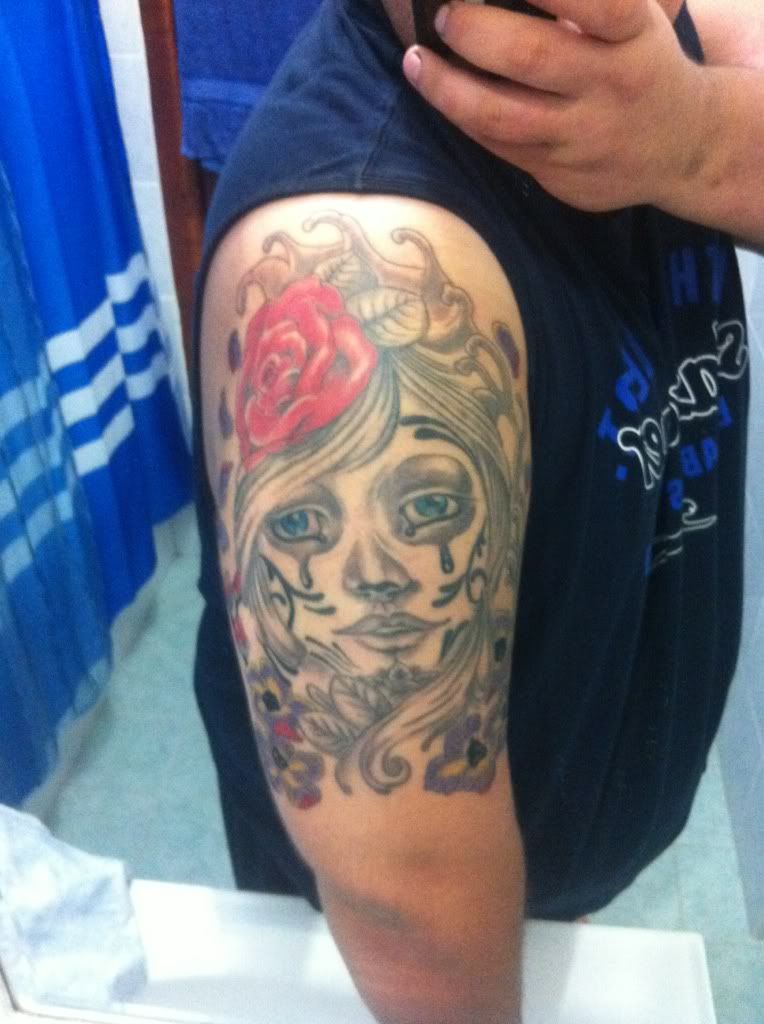
Looks sweet so far man, if ya get a chance or it’s possible take another pic maybe a little more in focus so we can see some of those smaller details.
is it water at the top?
what are the heavy black spots in flower down low?
is he finished her hair?
yes, those are fat guns, we should do arms together
Not water up the top, just some fill design. The heavy black spots are there because they just got touched up and are standing out alot more.
Yeah her hair is finished, I wanted her to stand out and not have the rest of the tattoo take away from her and that was one of the ways of going about it, alon with colour choice etc.
I will put a better pic up in a sec.
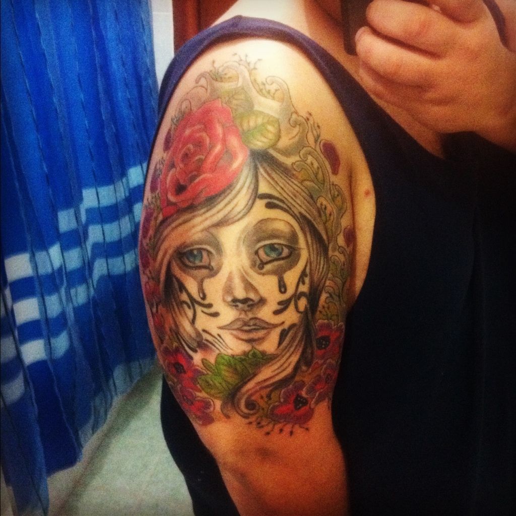
im sorry but this doesnt appeal to me at all which is a shame because i love the day of the dead girls usually, the flowers at the bottom are not nice or complimentary and i think that the face could have been done so much better, the idea is good but the execution is lacking im afraid, though this is just my opinion and as i always say, as long as YOU are happy, that is all that matters 🙂 x
Look what we’ve done to you. lol
Congrats on your tattoo and best of luck on your next sitting! :):):)
Nah! It’s ok! I asked for honest opinions. I appreciate it!
What do you think is wrong/off and what can be done to enhance?
You need a better artist, this one isn’t good, needs hair detail, stuff that looks like water at top is ugly, flowers at bottom fucked up, Leaves should have color if rose does, I don’t personally like mixing day of the dead with the sad clown look, it ain’t working in my mind, black is uneven, lines on her face dark, flower centers dark, everything else light, artist just isn’t very good,
Wish you could bring it to Atlanta, this could be fixed up into a real good tattoo
^^ exactly what mrchen said, if you want some inspiration for these girls can look, look up david corden’s artowrk, he does some stunning pieces, the “flowers” at the bottom are the part that i dislike the most im afraid, they look like something a 3 year old drew for mothers day, and it might just be the angle of the photo but the compostion of her face makes her look quite squashed and out of proportion. i agree that if you’re going to put colour into the rose then you should include the leaves too, it looks unfinished otherwise and i think that her face and hair needs a lot more shading and careful linear work to give her more depth and not look so flat.
I also agree that you should not go back to this artist, if the person you next consider’s portfolio doesnt even compare to the girls by david corden then keep looking 🙂 good luck hun and dont worry, i have some shitty ones of my own, but i learned my lesson 😉 x
I know it’s not everyone’s cup of tea, but some more progress;
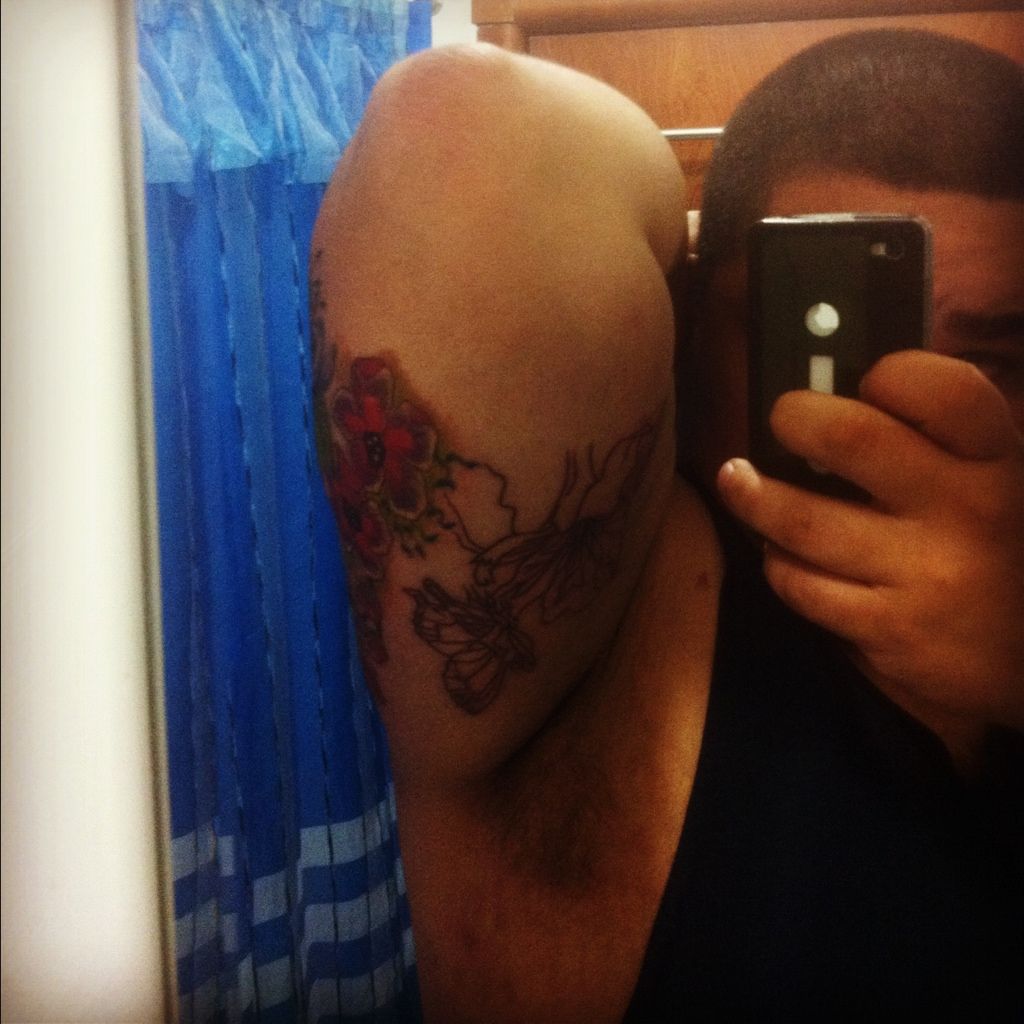
Obviously I took on board some things that were mentioned here earlier. The inner arm kills an I have like another 8 hours in there to go!
How did you all cope with the pain of the inner arm? Cause it took alot out of me just for some outline… Let alone the colour and text that will be going in!
I like it and think it is coming along nicely.
For my personal taste, I would like to see more umpff lol in the face, maybe some darker shading, stronger lips etc
You must be logged in to create new topics.
