Hi..I’m new here and this is my first Tattoo. Be honest, tell me what do you think about. THANKS!!! 🙂


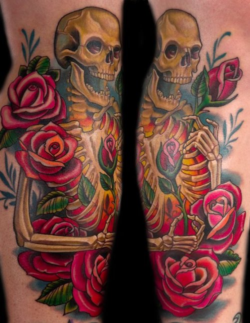
Together 1:

Together 2:

Tell me also, what do you think about the technical aspect of the tattoo… would be great to read your meaning about it.
I like the design overall, but the execution is only so-so.
Pretty cool design, not the best quality I’ve seen, but by far not the worst.
OH..thanks for your answers.
WHAT COULD HE (the inker) HAS DONE BETTER? Sharper Outlines… better Shadows?..different colors? Whats wronh with his done quality?
Would be nice, if someone could tell me this too.. so I have a better Idea how it have to look for my next tattoo… you know?
The actual drawing could have been better. The roses lack consistency as far as shape. I would like to see more variance in line weight to emphasize the areas that need it. Plus with all this color the artist could have really saturated the image and packed tons on color in it to make it really pop. Alot of this stuff can still be done. I wouldn’t trust the original artist to do so though because he or she didn’t see these things in the first place. All in all it’s not bad it could just be a lot better. It looks like a tattoo done before the “renaissance” in tattooing in the 90’s when artists really raised the bar.
um… I was looking for a rough design. It’s only my humble opinion, but if I see anywhere a Tattoo who looks like “perfect” I’m confused. I like it much more..if a Tattoo looks like “handmade” not like ” perfect printed on skin”. This is not an excuse.. I’m not the artist.
But..I appreciated so much your meanings about the work, I want to expand my knowledge about tattoos…
THANKS TO ALL WHO WROTE AN ANSWER 🙂
this is good street shop stuff, classic images, skull, ace of spades, roses, gun, eight ball,
stuff kind of off,
bright blue band in pale green hat,
spade eyes on skull kinda unusual but ok,
card in hat looks poorly drawn,
sunshine yellow teeth on skull shaded, should have used a different color,
roses are colored strange, red, orange yellow,
one color with fade would look smoother,
spider web being orange yellow is an unuausal color choice, just not the norm,
leaves start at too light a green, drawing elements are kinda thrown together, but……..nice piece at 20 feet right!
all in all, good street tattoo, will look good going to local bar,walmart, bike week,
what is picture quality work? paul acker horror, joshua carlton realism, josh woods new skool, russ abbott and timmyb american tattooing, stuart and company from spider murphys shop to classic sailor jerry nautical stuff, bob tyrrell for black and grey
but nothing wrong with a tattoo like this,
its ok. the shading is a lil flat making it lack depth and the line work is a lil shaky. but overall its a good design.
Im noticing especially the black and grey shading looks very weak and not blended well. Looks blotchy and rushed,,,unless that’s the look you’re going for. And why the hell does the revolver have a yellow trigger, that just looks wrong to me. Nothing terrible but overall I think it’s a decent tattoo…could’ve been done worse but could’ve been done better.
Nice first tattoo. You have already herd most of the bad about it how about some good.
Very cool design. the hat looks nice. Lots of cool traditional things in there.
The eight ball looks real off to me.
the wobbly lines drives me crazy but as the others have said its not the worst.
You said in your original post that this is your first tattoo but inside the shine on the 8 ball and underneath it looks like really really faint possibly lasered old ink which you have covered. so did you in fact have something here before which you have had removed and then gone over it? because the little blue dots in and around the 8 ball are making it look worse, so i would maybe find a way to shade them out? x
But..I appreciated so much your meanings about the work, I want to expand my knowledge about tattoos…
THANKS TO ALL WHO WROTE AN ANSWER 🙂
No tattoo is perfect, but a well executed tattoo shouldn’t have shaky lines, poor shading, and so forth. Check out this piece by world-class artist Russ Abbott as an example of a really well done piece.
r
MG… that’s really good. Thanks for posting 🙂
You said in your original post that this is your first tattoo but inside the shine on the 8 ball and underneath it looks like really really faint possibly lasered old ink which you have covered. so did you in fact have something here before which you have had removed and then gone over it? because the little blue dots in and around the 8 ball are making it look worse, so i would maybe find a way to shade them out? x
Yes.. under “my 1st” Tattoo is a older one, but not a real Tattoo! That means, I made it as I was 15 years old by my self with a needle and ink. It is only a very small “self-made”Tattoo in the quarter size of a thumbnail. It shows 3 dots ( means: Anarchy ) and it shows: “EK88”.
I told the inker that he should keep my old tattoo, ’cause behind it is a long, long.. story and it is very important for me to keep this self-made Tattoo.
This is the reason why the 8Ball looks so ugly 🙂
You must be logged in to create new topics.
