I am so excited to have gotten my very first tattoo. My friends all seem to love it. I absolutely love it. It has profound meaning to me and my life history, and is something I will wear proudly no matter what. Regardless of its meaning and value to me, though, I do appreciate the aesthetic analysis of anything like this, especially tattoos. I got it done for free, but the guy is a professional, he works out of a well cared for shop with good equipment. He is rather new though, only been working for a year… it was my going away present considering I just graduated college.
Tell me what you think, the good and the bad. I am not afraid to hear any of it! Thanks for taking the time out of your day.

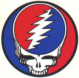
By the way, it was inspired by this pin, which I’ve worn for years:

Someone posted this critique on another forum and I answered it. I figured I’d crosspost it here, to add to the discussion:
“It looks uneven. The first row of feathers on the right side has 7 sections and the same row on the left has 8. But on the main part of the wing there are far more “feathers” on the right side. The line work is not the best I’ve seen but if it means so much to you and you’re happy with it then that’s all that really matters.”
I noticed that. I am quite happy with it. there are a couple of flaws that I did notice.
It is ever so slightly uneven, yes, although when you look at it fully from 3 feet away or further, its practically unnoticeable. The symmetry as far as distance on either side from the spinal column is even as can be. The right side has 7, the left side has 8 on the feathers. Also on the bottom, the right side has 5, the left side has 6 feathers. I’m not sure why this happened, maybe he realized it too late and tried to fuck it up less. The main feather areas have 7 on either side. So there is a missing layer of feathers on one side, and an extra on the other. Also, the left side is VERY slightly separated from the skull than the right side is.
I do like the shading and coloring, though. The blues, reds, and even light yellow in the bolt came out better than I thought it was… the color is VERY vibrant. The tattoo does have great meaning to me as well, and I am taking very good care of it… just a sheen of A + D lotion, washing it with organic aloe soap and not heavy washing it, its not scabbing, keeping its consistency. I like the “Grateful Dead” text and the banner came out well.
The good news is, as long as one is not up close and counting, the discrepancies are far from noticeable. The biggest discrepancy, imo, isn’t the number issue, but the less individual feathers on the left side than the right side. Am I correct in assuming, though, that a touchup could actually fix this issue, leaving the only problem being the one extra feather on the left and one less feather on the right? I think that might be good if I could do that.
Otherwise, though, nobody has noticed except those who have seen big, blown up pictures of it.
Hey
I like the idea and didnt notice the feather numbers. But I really don’t like the writing – it’s bubble writing, compared to the font that was on the pin. It’s nto that noticeable though, I’ve just spent ages going over fonts for mine.
As long as you’re happy, that’s cool!
i know this piece means a lot to you and i know you got it for free, but i think you should have paid and got it done right.
the greatful dead text is completely different from the band logo text, the shading in the uper feathers looks like it is rippled and nothing like in the pin picture, and if that piece was by myself then i would not have outlined everything in the way that your artist did and i wont even go down the route of the extra feathers, we all have different perceptions of how a piece should be done and you will always get different critique from different forums.
the main thing is that you have a piece of work that means such a lot to you as an indevidual and you are super happy with it… and thats the main thing 😉
ps… welcome to the addictive wonderful world of ink…… so whats your next piece going to be :p
I appreciate both of your opinions. Is there any suggested reworking of it that is at all possible to make it slightly higher quality? If not, I accept the quality of the work as is. It may not be the kind of work I’d pay out my ass to get, but as a free peice from a good friend, as I mentioned before, it has a lot of meaning for me. Furthermore, it introduced me to this wonderful new world… and its something I’m going to be doing quite the more often, I can feel it. I’m not going to lie, it kind of sucks that my first permanent peice has a few glaring flaws like that. I REALLY don’t mind the bubble text, that’s fine by me. The only major issue I kind of was upset about was the differences in fether counts, but as a few others have mentioned on the forums, and judging from the reactions from my friends, that is completely and absolutely unnoticed unless you’re up close and staring pont blank.
The rippled feathers is ok… There are actually several versions of that pin out there, so it can easily be passed off. The more important part is the symbolism of the feathers from the GD SYF symbol. I can definitely accept the difference in ripples. Would it be worth it, as I asked before, to go get it retouched sometime to make the sides look similar in terms of number of ripple patterns?
If I did that change, would the tattoo aesthetics at least improve marginally?
Any other ideas?
And yeah, as I said before, I absolutely love this tattoo. I know it has its flaws, as does every human being and most works of art, but I respect the professionalism of the tattoo industry and would love to work on honing my skills for learning what I need to look for in my future tattoos.
In the good news, it hasn’t scabbed up at all and I’m taking damn good care of it. It flaked a tiny bit… almost like skin peel from sunburn, but not scab, which I hear is a good thing.
Well, it looks like Outlaw and the other forum dude mentioned everything I noticed after a cursory examination, so all I can add is this ain’t a piece of ink you ought to be proud of. It’s on the lower end of mediocre, and the skull is crowded and misshapen.
I’m sorry to say, this is definitely something you’ll want to get covered up in a couple years.
Love. Peace. Metallica.
I’m sorry to say, this is definitely something you’ll want to get covered up in a couple years.
Love. Peace. Metallica.
Man now people are telling me its horrible on these forums, lol. I know it’s not fantastic, it does have a lot of personal meaning to me though. Should I be embarrassed to take my shirt off until I get it covered or something? I mean people who have seen it IRL seem pretty stoked about it… but damn, from the opinions of those on the high end of the business, it’s utter scheise. I thought I liked it a lot, now I’m second guessing myself.
Anything I can do it clean it up and make it marginally better?
Also, as far as a new tattoo, I’ve got to put a lot of thought into it. It took a year of thought to confirm this was the first one I wanted.
This is the way the skull is supposed to look btw… I don’t think he’s so far off it. One side is supposed to have 3 more lines than the other side.
Anything I can do it clean it up and make it marginally better?
Also, as far as a new tattoo, I’ve got to put a lot of thought into it. It took a year of thought to confirm this was the first one I wanted.
Personal meaning. Ugh. I *HATE* it when people justify a tattoo with that whole personal meaning crap.
Look, this is just my opinion, and in the end, your own opinion of your ink is what matters most. With that said, personal meaning means exactly jack shit. The whole purpose of art, in any form or medium, is to elicit a response, a gut level reaction. The more explanation a piece requires, the more of a failure it is. In short, art exists to be awesome.
Your piece wasn’t done with very much technical skill, which is bad because it wasn’t that solid of a design to begin with. However, it isn’t horrible. If it was, we’d have flat out told you it sucks ass and you ought to be ashamed of yourself for getting it. We’re a bunch of harsh ass mother fuckers around here. Check out the thread a month or so ago with the guy who got the anime girl tattoo who claimed it didn’t suck because he got it from his dead buddy. We tore him a new one.
Yours is just….bleh.
As for if you should be embarrassed, that’s up to you. I’d be ashamed of it, but I’m an ink snob, and I’m trying to finish my portfolio so I can go and try to get apprenticed.
One thing I can tell you though, is that most people don’t know a good piece of ink from crap, and even if they do, few are going to tell you it sucks because of how personal your ink is. Alot of people will totally flip the fuck out on you if you tell them their ink sucks. Last time I was at an MMA event and told one of the fighters in exhaustive detail why I felt he should be ashamed of his ink, the only thing that kept me from getting my ass seriously kicked was the other guys holding him back. Most people won’t risk that kind of confrontation, or hell, just risk hurting your feelings, so they’ll tell you what you want to hear in regards to your ink.
Honestly, I don’t think you can salvage this thing short of a laser/redo, or a massive coverup.
Just saying.
Love. Peace. Metallica.
Hey thanks dude, and it does have personal meaning. But I’m not trying to justify anything with personal meaning, besides my own enjoyment of my ink. I asked you guys to be harsh, and harsh is what I got, so I have no qualms with that. I in fact thank you, so very much, for this post and the others (including others who have commented on the ink). I do like my tattoo, but you’re right, I see that there are flaws with the skill involved in it. Still, you’re right on another level. Most people really DONT know the difference between amazing ink and crap. I have friends who are much worse off than I am in that department, haha.
I’m honestly just elated to have my first piece of ink. From standing distance, about 3 feet away, I swear you really can’t notice any of the imperfections mentioned above. Only if you come real close and look hard, in the same way that this tat is blown up and posted here, do the imperfections come to light… and that’s only if you are looking at it with a critical eye (IE counting the feathers). Even those, if you’re looking from real close, are hardly noticable unless its one of you awesome tat artists out there (and I say this without snark, I really do believe you guys are great!).
I think that the one flaw that IS noticible from 0-3 feet, though, is the more shading/pannels on one side of the wing than on the other. So tell me, looking at that tattoo, would there be a way I can add more panels/feathers/whatever you want to call them to the other side to balance it out a little and still keep the integrity of the tat?
Oh, and also, I LOVED the process of getting the tat. I plan on having many more, and using this as a learning experience 🙂
Look, this is just my opinion, and in the end, your own opinion of your ink is what matters most. With that said, personal meaning means exactly jack shit. The whole purpose of art, in any form or medium, is to elicit a response, a gut level reaction. The more explanation a piece requires, the more of a failure it is. In short, art exists to be awesome.
Your piece wasn’t done with very much technical skill, which is bad because it wasn’t that solid of a design to begin with. However, it isn’t horrible. If it was, we’d have flat out told you it sucks ass and you ought to be ashamed of yourself for getting it. We’re a bunch of harsh ass mother fuckers around here. Check out the thread a month or so ago with the guy who got the anime girl tattoo who claimed it didn’t suck because he got it from his dead buddy. We tore him a new one.
Yours is just….bleh.
As for if you should be embarrassed, that’s up to you. I’d be ashamed of it, but I’m an ink snob, and I’m trying to finish my portfolio so I can go and try to get apprenticed.
One thing I can tell you though, is that most people don’t know a good piece of ink from crap, and even if they do, few are going to tell you it sucks because of how personal your ink is. Alot of people will totally flip the fuck out on you if you tell them their ink sucks. Last time I was at an MMA event and told one of the fighters in exhaustive detail why I felt he should be ashamed of his ink, the only thing that kept me from getting my ass seriously kicked was the other guys holding him back. Most people won’t risk that kind of confrontation, or hell, just risk hurting your feelings, so they’ll tell you what you want to hear in regards to your ink.
Honestly, I don’t think you can salvage this thing short of a laser/redo, or a massive coverup.
Just saying.
Love. Peace. Metallica.
LMFAO! Found the Anime tat thread… Damn, I know I probably shouldn’t be saying anything because the artists here don’t seem to think highly of my ink, but that was downright grotesque… ahaha.
Alright, I feel more consoled, at least my tat didn’t draw THAT kind of response. 🙂
Hey, no, you’ve posted your picture on a forum that is filled with tattoo enthusiasts, so the criticism is going to be severe. I don’t have my first yet so I’m not particularly well versed, and I don’t think yours is worse than a huge lot I see around me at the moment. It has flaws yeah, but most people aren’t going to sit staring at it specifically looking for flaws.
Don’t let other people’s opinion make you doubt it. Look at your original post and what you’re saying now. This is YOUR tattoo, not anyone elses. i know you wanted opinion and it’s really good that you can take criticism so well, but don’t instantly start worrying about it. See how you feel in a few months.
Also, I’m getting a meaningful tattoo. Yeah, I want it to look fantastic, but hey, I personally believe that art on your body, however beautiful, should mean something to you – that’s why you have it on your body right? Sure, you can take the aesthetics view of Knighthawk’s, that art is most important for opinion, but that doesn’t make it the cemented law of what you HAVE to look for in a tattoo. I think art should have meaning.
Thanks Poesy, for real. Next tat I get I will put more work into it. I was not displeased by the way this one came out when I saw it, not in the least, and I will proudly rock it out wherever I go. I’m glad to get opinions from all of you though and undoubtedly it will help me in the future! 🙂
You must be logged in to create new topics.
