Hey guys.
Okay, so I’m always thinking of new things that I want to get inked and now I have some questions about text.
First off, I want to get a couple names (my young niece and nephew, if I remember the correct English words for it) on me, but I am pretty lost as to how to ‘close’ the tattoo. I’ve googled but all I see are these plain text tattoos with long sentences and such, which work as they are but since mine are just two short (maybe 2-3″ in length each) and stand-alone words I don’t feel they could work all alone on their own. Text on it’s own is pretty dull and I don’t like Traditional so a flowing banner is pretty much out of the question. ‘Framing’ them will not work because hopefully there will be at least one more name added.
I haven’t seen too many text tattoos in real life so I am sorely lacking in cerebral stimulants. Collectively, you guys have ‘seen it all’, so I’m hoping you can give me some ideas.
The big issue is that this must NOT look like a memorial tattoo in any way. This is just a celebration of two adorable human beings, combined with my own love for fantasy.
My only real idea is to just have the text and then a swirly gray ‘cloud’, ‘fog’ or ‘wind’ backdrop that fades quickly into nothing, to allow for easy attachments with other future tattoos. A third or fourth name could always go over the soft backdrop.
Secondly, I’m wondering about the actual design/tattooing. The font is of course pretty bold and high-contrast, and perhaps a tad too ‘tribal’ for me. Would it be possible, and would it look good, if they were done in black/gray instead? Maybe black outlines and then filling with gradient to create some effect? I’d be open to some soft colors if that would make it pop, but I am a B/G fan so I’m not actively seeking colors in it. Or would simple white highlights turn the angry black into something softer?
Thirdly, I am wondering about the placement, but that of course always depends heavily on what would need to be done with the tattoo to suit me.
If I put them on my arm, despite only wrapping half-way around, will they look like a tribal band? Or will softening them up take care of that? I’ve always aimed at getting at least half-sleeves on both arms, so I was thinking I might incorporate some sort of ‘Tree of life’ concept, where some branches would be behind the letters, and even some flowers and whatnot, but since I’m watching my depts increase almost daily thanks to our failing currency, I just can’t afford the luxury of getting a full sleeve right now. The names will have to do for now, and the rest be added later.
I really like the idea of tattooing my own children on my left chest/heart so although I love my niece and nephew as they were my own children, I am not sure they belong exactly there. That being said, we never know how our lives will turn out and I may find myself impotent or single or dead, so I might never have a child of my own anyway. Is it silly to put their names on my right chest instead?
Also, a bit on etiquette: You women out there… I know ex-girlfriends and wives are a nono, but would it be odd for a man to have a tattoo of the names of children not of his own on him? They are a little bit my children, even though I’m just a favorite uncle.
Lastly, which do you guys think look better… normal or italic?
Thoughts and opinions always welcome, as long as you don’t diss my nerdiness.. it’s there to stay 😀
Here are the names, plain and italic, and also with Word’s Shadows added just to give them a bit more life:
I’m not going to comment on placement, simply because I don’t know. The only thing I can think of is if you get it over your heart, and have your own kids one day, you may regret it.
The font I liked most was the third down, maybe some grey-wash to pretty it up a bit (if it’s possible with the backdrop shadow).
i was wondering a little too what happens if you meet miss right and have your own children ?
but hey hoe i like the 3rd one the most 😉
Isn’t that elvish? And the names are silya and latedare? 🙂
Yeah, this was my concern. But like I say, I think I can keep my ‘stepchildren’ on my right chest and still keep room for my real children on my left. Although a bigger part of the heart is on the left side, it’s really just in the middle so each are really close to my heart anyway.
The gray backdrop was just to give it a bit of life I’d not keep it in the tattoo, unless as something the artist would do to give it life. I’m starting to agree with you guys that the non-italic may just be better indeed. I’m playing with a very flowing cursive font right now (like the one on the one ring) to see if I’d like that more, but I’ve yet to make up my mind.
Would you find it odd to have them there, or are you more wondering about the wasted space? I love these children like they were my own and want them with me always.
Hah! Very good. Silya is the phonetic equivalent to the Icelandic name. But you’re reading the other name slightly backwards. It’s Alexander 😀 X is K+S and ND together make a single Tengwar letter 🙂
im not honestly sure , my nephew is not born yet so i dont know the feeling .
space ? depends on the size and where placed :rolleyes:
Hehe, my elvish is a bit rusty, that x mark did seem a bit odd, and ofc it should have started with an a with the a spots on the top. I too have a elvish tattoo, care to take a shot and uncover what it says? 😀 You can find a pic of it in my gallery. It’s written in Tengwar and the language is Quenya.
Well, depending on where to start in the circle, it says Asar Iislum Iimal, but the translators are unable to turn it into English… unless there’s someone you want to hang 🙂
I changed to the cursive (one ring) font and now I can’t really decide which I like more. Leaning towards the new one though, since it is ultimate nerdness 🙂
Hi
Late in on this but if I had to choose for a fancy font it would be second one down on last post.
If they mean a lot to you get it done and you can always have them done in some cupped hands with room for more – so you can say that you are holding them close to your heart.
Take Care
Matthew
It says Isilmé, míla and sara. Meaning moonlight, to long for and bitterness.
LOL.. this time I read it backwards 😀
And this is ‘true’ elvish then… very cool 🙂
Hey! Well, it’s funny, cause all the tattoos I get are text. It’s still a work in progress, but I’ll show you how my back is shaping up.
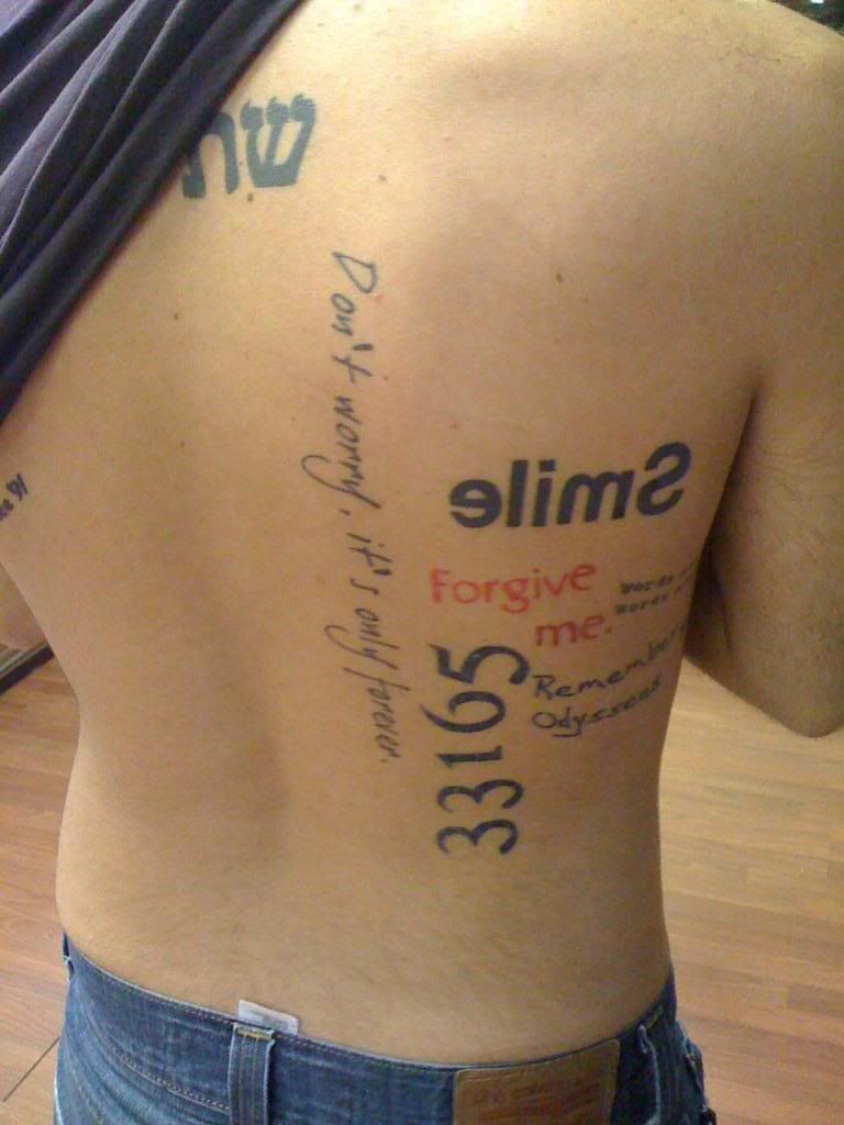
I still have a lot to go (typography is small!) but I plan to follow the contours of my body and have a light gray back drop of words to fill in the negative space. I’m going for the “wall of text” thing. I also have the rest of my pieces in my photo album. Cheers!
You must be logged in to create new topics.
