hello im new to this forum. so hello to everyone haha.
past week or so ive been drawing some things and thought id share them with you lot. my girlfriends cousin may have got me a shot at a tattoo apprenticeship and ive always wanted to get into it. so i thought i best start getting a bit of a portfolio together so i can show them something when i go see them.
mainly been messing around with japanese designs and had a little go at new skool too.
comments good and bad welcome!
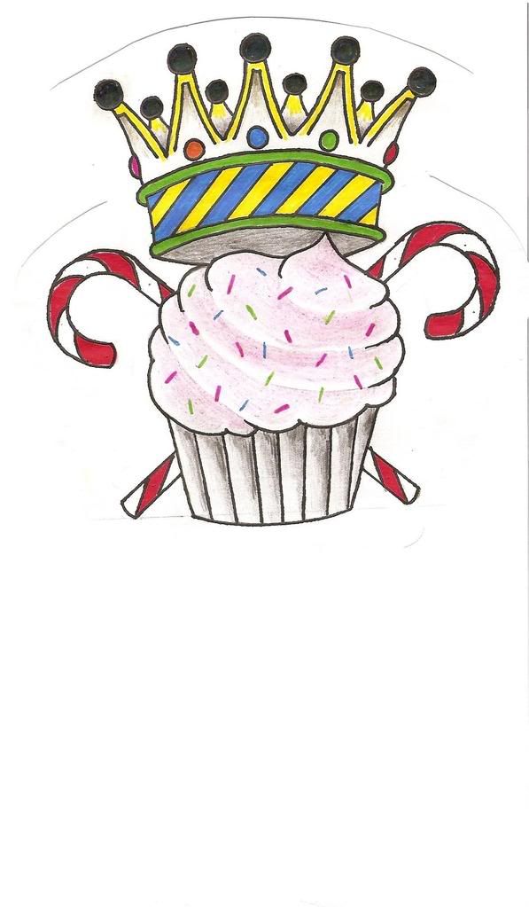
new skool cupcake/crown crest.
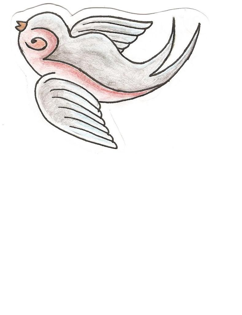
swallow.
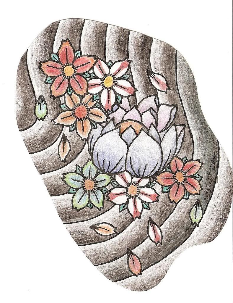
lotus flower with cherry blossom.
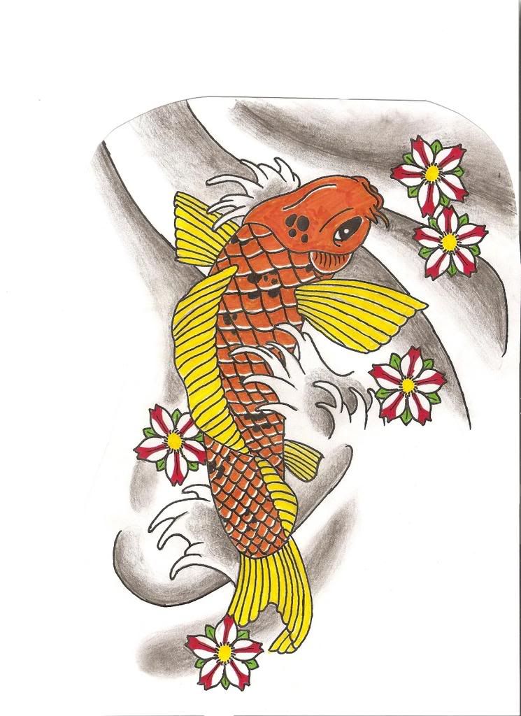
koi fish with cherry blossom.
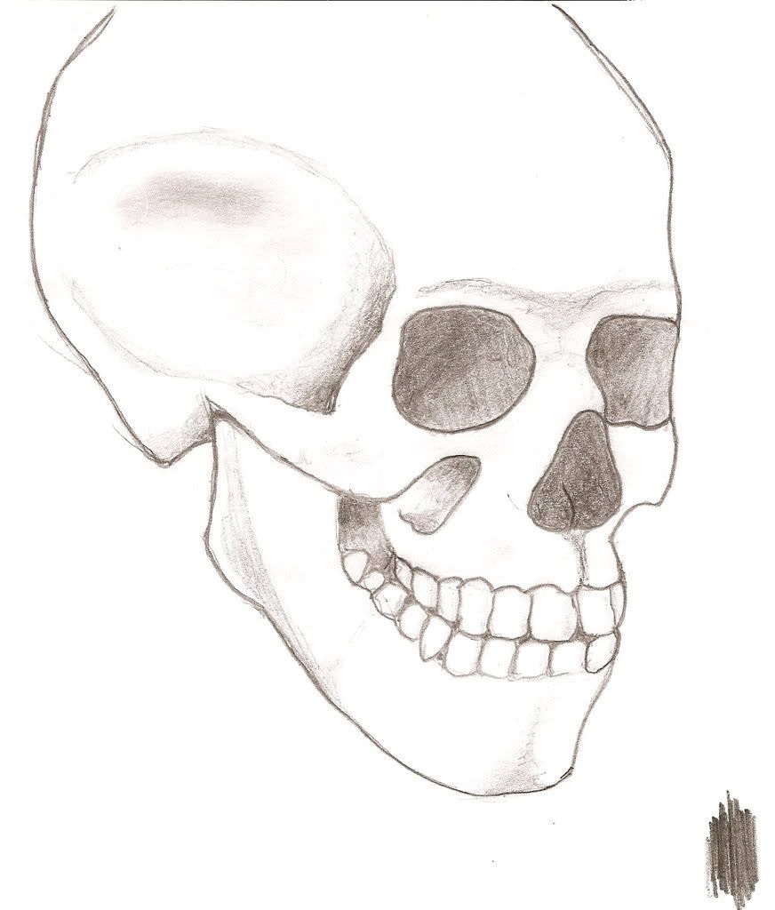
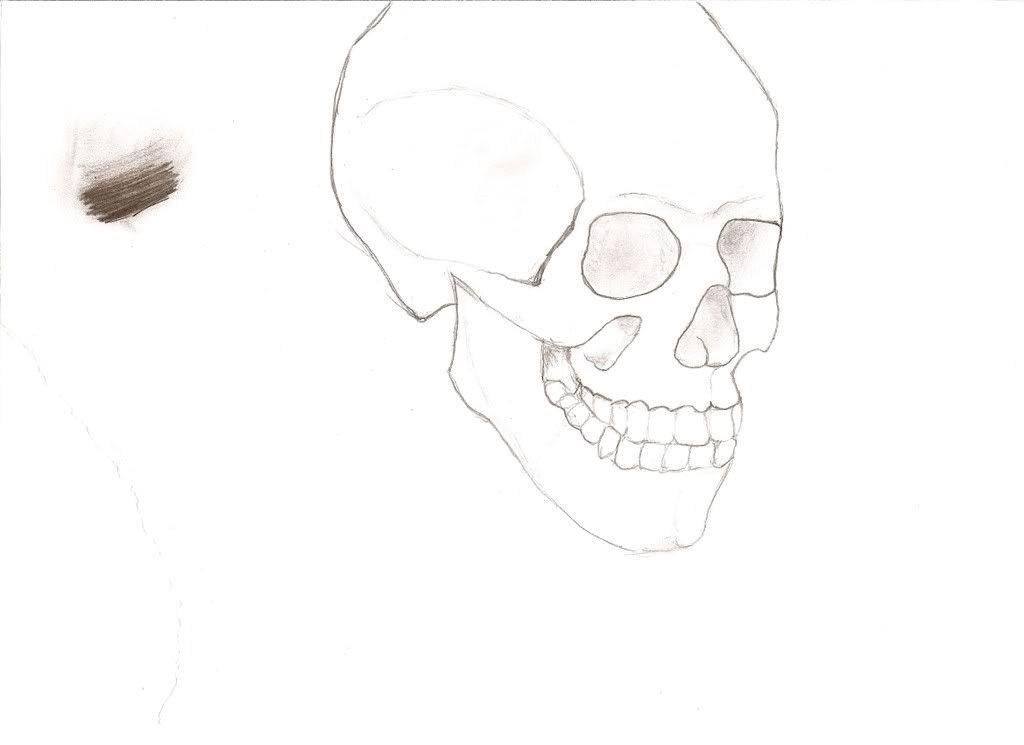
and my first real attemp at drawing a tonal skull.
http://i275.photobucket.com/albums/jj298/j0hn-d/scan0009.jpg
hope somebody likes them.
all my drawings are free hand with no trace work.
some parts are copied by looking as i am drawing them.
if anybody could tell me if images such as these would be suitable to show the tattoo guy it would be great also?!
thanx
First off welcome to the forum. I hope our feedback is useful to you. I’ll give you a little commentary about each piece.
The new school piece: it’s pretty decent. The shading on the cupcake is nice. But the crown entirely throws me off… There are sweets and then… A crown? You have all of this wonderful shading on the cupcake and then you fall short with the… Crown? Give it some shine to appear like gold and jewels.
The swallow: good but the eye throws me off. This one looks like you were entirely drawing off of something else.
Cherry blossoms and lotus: love at first sight. ‘Nuff said.
Koi: very nicely done. The water puts the piece together.
Skull: you’re not done with this one. This is where you can really show some skill. Where’s all the shading? Do you have yourself a still life for this or are you looking at a 2D image only?
You have a lot of room for improvement but you’re definitely on the right track.
thanks for the nice words 🙂
i understand where your coming from about the crown looking back i shouldnt of coloured it in markers haha. ill take that on board when i draw some more 🙂
the swallow was done from looking at another image as i was just browsing google images and thought id try draw it. lol
glad u like the lotus with cherry blossom, i was slightly dissapointed when i scanned that one in because the colour looks really faint because the pencils i used wernt the best.
all in all thanx for ur comments gives me bit of confidence to carry on at it. 🙂
the skull isnt finished as u say im working on that one as we speak 🙂
ok so ive re-worked the skull, i personally think it looks miles better with a lot more shading but it could still do with a bit more.
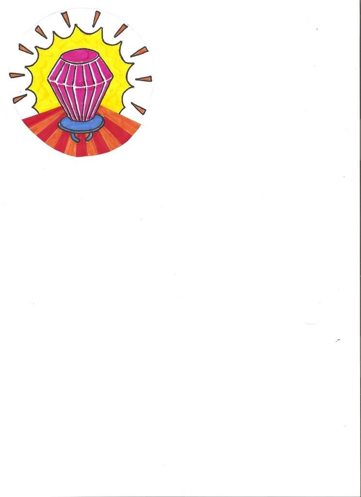
had another little pop at new skool with this ring pop (ecxuse the pun)
also been sketching this for my girlfriend.
as you can read its the word delicate which is a song by damian rice who she is a big fan of and she is also a photographer so i thought id put a little bit of that in aswell.
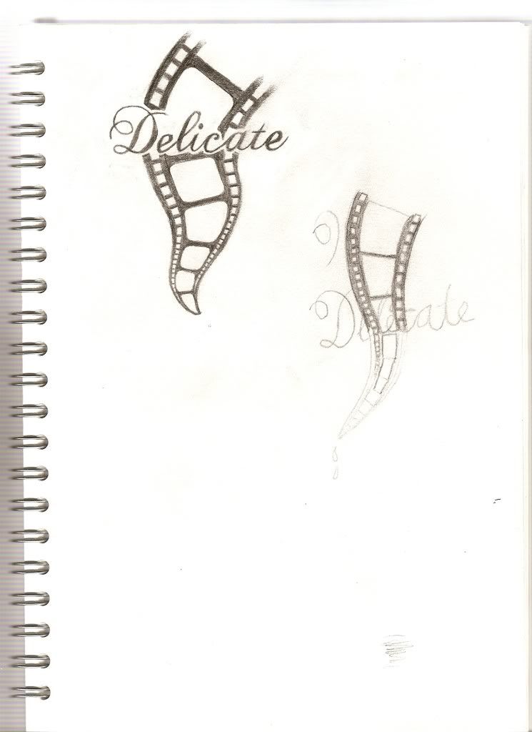
it is alot cleaner than it seems its just my scanners a bit shit and i didnt want to edit any pics.
as always any comments welcome.
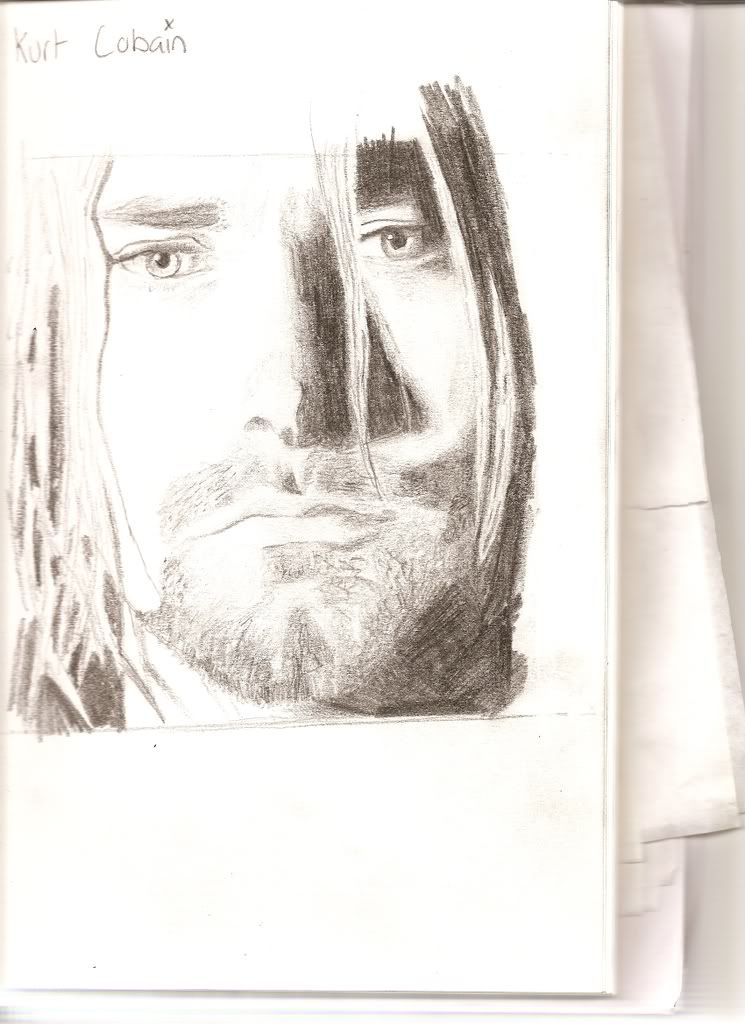
another one from last night. sat up all night doin this so i hope somebody likes it.
tell me what u think!
Skull: looks better, but still needs some work.
Ringpop: adorable, but much like the crown you need glint marks or shine.
Delicate: awesome text work. The film tape totally takes away from the wording. If you’re going for feminine, the tape needs to be curly and rounded.
Kurt Cobain: nicely done, it definitely looks like him. To make it better try working on your darkest and lightest shades. This will add more dimension to the piece.
You must be logged in to create new topics.
