Hi guys and girls,
I am looking at getting my first tat at the end of this month, for my 25th birthday. I have been thinking about tattoos since I was 17 and wanted to get a tattoo to fill my right shoulder blade (a tiger on the banks of a river in front of a waterfall, could picture it but didn’t have the money back then). This is still on the cards but I think I want to get something a little smaller for my first one.
I have been thinking of getting a script style font tattoo done on my forearm, going up the forearm, so it would be horizontal with arms outstretched. About a year ago I started thinking about it and wanted to have “Eternal Family Love” done in spanish (Eterno Amor de Famila) but I think I have now settled on “The Family Circle” (El Círculo Familiar). The spanish is because 2 years ago I traced my family tree (the line my surname “De La Torre” comes from) back to Chile and have a real connection with that part of my family tree after spending so many hours tracing it and finding background information on my ancestor.
So here is the hard bit, trying to find a font that I like that will look go for years to come. I really want it to look unique but realise this is hard with standard fonts for the PC. I have NO artistic talents whatsoever so am stuck a bit. I have found a font that I like but am wondering if it would look any good as a tattoo and whether it will stay looking nice with fading and blurring which I realise is inevitable with time.
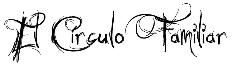
Here’s my first idea:
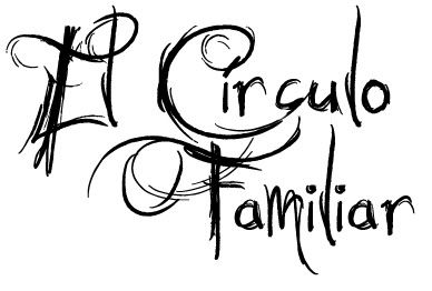
I also really like this sort of thing:

Any help or suggestions would be great.
Thanks for taking the time to look. I really appreciate it.
Aaron
I am looking at getting my first tat at the end of this month, for my 25th birthday. I have been thinking about tattoos since I was 17 and wanted to get a tattoo to fill my right shoulder blade (a tiger on the banks of a river in front of a waterfall, could picture it but didn’t have the money back then). This is still on the cards but I think I want to get something a little smaller for my first one.
I have been thinking of getting a script style font tattoo done on my forearm, going up the forearm, so it would be horizontal with arms outstretched. About a year ago I started thinking about it and wanted to have “Eternal Family Love” done in spanish (Eterno Amor de Famila) but I think I have now settled on “The Family Circle” (El Círculo Familiar). The spanish is because 2 years ago I traced my family tree (the line my surname “De La Torre” comes from) back to Chile and have a real connection with that part of my family tree after spending so many hours tracing it and finding background information on my ancestor.
So here is the hard bit, trying to find a font that I like that will look go for years to come. I really want it to look unique but realise this is hard with standard fonts for the PC. I have NO artistic talents whatsoever so am stuck a bit. I have found a font that I like but am wondering if it would look any good as a tattoo and whether it will stay looking nice with fading and blurring which I realise is inevitable with time.
Here’s my first idea:
I also really like this sort of thing:
Any help or suggestions would be great.
Thanks for taking the time to look. I really appreciate it.
Aaron
Hi aaron,
I know nothing about script tattooing but personally I like the first photo better. I see a ton of script tattoos online and, to me, they all look the second photo. I would keep googling script’s but I think your next step should actually be talking to an artist. Maybe a tattoo artist if that’s all you can find but I would ask around to your friends and see if there is someone you can grab a beer with and you can sketch out different ideas while you are sitting there together.
Talking to an artist now might be a good idea. Your arm is prime time real estate for tattoos and you will probably want to consider a sleeve at some point. Consulting an artist will give you the road map to get from where you are to where you want to be.
Anyway, just my .02.
Thanks for you suggestion.
I have been playing around with placement ideas with my sister and we thought it might be easier to place with the wording on two lines. Any thoughts on this?
I got rid of a few of the extra scribbles as well. Think it looks a bit better like this even if I am to get it in one line.
You must be logged in to create new topics.
