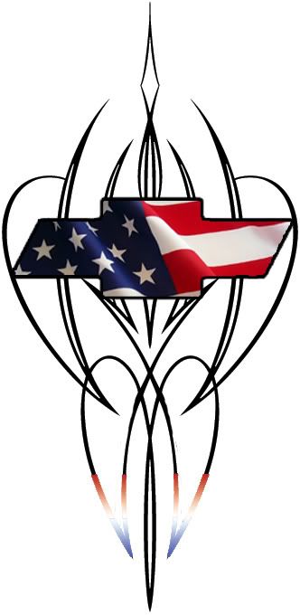
I am doing a memorial tatt for a good friend of mine. It will be from my elbow to my wrist on the inside of my forearm. I wan it to be black and red pinstripe around a stars and stripes chevy bowtie. I am putting in a pic of the original picture that gave me the thought but it is a shirt so I would like it altered. I just like the layout f it but with the pinstripe I described and not what is in the pic. I would like to keep it within 3″ wide at the top and as wide as 2: at the bottom(if needed), and approximately 6-7″ long. Any help would be greatly appreciated.

well even though I didn’t get any replies I will post up on what I got anyways…
Kinda close to what I wanted, the bottom of the stripe is red and blue to commemorate my fried with the being his initials, V.V. The drawing is what I gave the artist and there is a pic of the finished product….
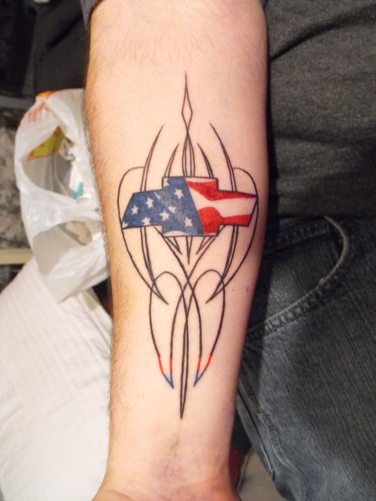
Right ok, sorry about your friend, are you happy with the tattoo? because frankly i wouldnt be, i think the artist couldve done a hell of alot better.I’m sorry if i sound a little harsh, where is the white? the lining is not the best. Was the artist in a hurry? Was it done at a studio or by a kitchen wizard? I didnt see your earlier post so im sorry i couldnt have maybe given a little advice. The concept is nice i like it
as a meorial piece i would be rather pissed off about the quality, but if your happy with it then thats all that matters, but personall i would get it sorted !
god damn it…. stab your artist for me please… could havee been executed much better…. ive seen back yard jobs look better than that….
Hi Trick
Sorry I did not respond to your first post as you specifically requested an artist and I fully admit I cannot draw for shite.
With regards to your tattoo I am going to give some constructive criticism – this is because I want you to get the best from your ink, and a memorial piece is seriously important.
Linework – Ok this is not good it is way wobbly. However this can be easily fixed by bolding out the lining which will make the tattoo stand out much better against the flesh.
Colouring – This needs to be gone over again and the lining of it needs to be sharpened – again not a huge job.
I would also recommend getting some white ink in there – yes it may fade or alternatively get the V V initials in there in fancy script and get that shaded through.
I would also recommend some shading done on the outer and inner edges to flesh out the tattoo. hell you could even use the red, white, and blue to add some colour to it. Or have them as flames coming off the edges.
Stars – These need sharpening again with bolder outline it can be fixed.
My advice is get yourself to an experienced artist who can turn that piece around into some serious ink.
I know you may feel ppl are ragging on you but 2 of them are experienced tattoo artists and know their shit – so please at least consider my suggestions.
As always
Take Care
Matthew
Hey, not bagging or flaming you at all, i get really annoyed when some so called artists are given a piece of artwork and dont do it justice at all. Not meant to offend you in anyway.:D
its hard not to sound like your bashing at a piece when it has not been executed to its full potential..
a memorial piece is something that should be treasured and not frowned upon by whoever looks at it.
but remember we are viewing it as artists and not as general public, so we do see it differently to others.
my constructive criticism would be:-
1. outlines i would recomend sculpting slightly to redefine their true shape and line weight consistancy.
2. the chevy badge i would powerline, heavily
3. a drop shadow could be placed under the badge to give better 3d depth of the whole piece
4. the stars could do with a thin outline in black and the white filled inside to redefine their true shape
5. the flag on the badge needs some white in it to add light source and some suble grey shading to highlight the wave effect
6. why have red, blue and black on the bottom pin stripes and not on the top ones?
7. the bottom pinstripes red, blue and black look very choppy and angular, a nice gradual curve was needed.
if you was nearer then i would have offered to fix it for free as this piece obviously has some great meanings to you
thanx for all the ideas. I thought too that it wasn’t as good as it could be. I will eventually get more to it. The studio I had do it was very recommended and has many awards but I do believe he rushed threw it because I didn’t let him do the design. I dunno. Keep the comments coming…I am liking the ideas….
I think it is great that you are welcoming the ideas! I like the design but it looks a little flat for me!
It is nice to know that people will be honest on here!
You must be logged in to create new topics.
