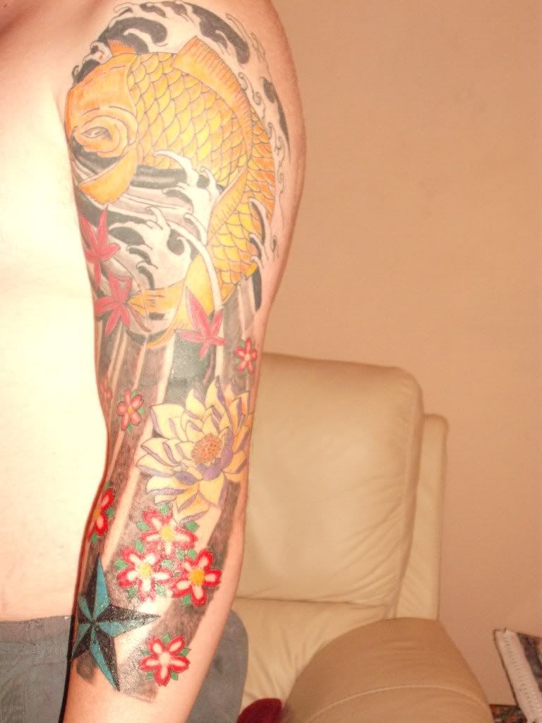
Here is sleeve not quite done needs more added to it grey white tones in between black lines and purple to soften vivid blossums.
11 hours roughly, however would like to know if its technically a three quarter sleeve even no ink dont go all the way around?
Just not sure if it needs more maybe something else something simple what about more maple leaves but that might be going over the top abit.
Is the koi fish a little weak if so what can be done about that?
A sleeve is a sleeve IMO.
For the Koi; as well as the wave/background you could have it just touched up. It looks a lil aged.
How old is the piece?
Hi
The sleeve looks great. The koi could do with some more shadowing and poss a bit more vibrancy on the yellow looks a little pale and washed out.
I would also add a bit more emphasis and detail on the fin and scales.
Small re-touch is all – but looking sweet.
Take Care
Matthew
hi , i like your sleeve design but i think your right that its laking a little something .
for my own tastes the lines would need thickening a little so everything stands out a bit more.
the koi could have some more detail added to it . a couple of black scales maybe ??
how long have you had this tattoo ?
Thanks for the advice certainly going to add more vibrancy to washed out yellow in fact, say vibrancy it dont need going over again so maybe another colour if so what think would suit??
it could just be a poor picture bad lighting in here that makes it look aged, only got it done last december 08 but adding new bits to it all the time as its done in sections.
The koi needs more emphasis on detail fins and scales.
I will be glad when its all done and can finally have have some closure as that is the thing about tattoos always wanting something changed redone or done different.
Hi
Orange and/or black would go very well with the yellow.
Maybe just a few scales here and there to break it up and a bolder outline.
It looks good and nothing wrong with tinkering with ink I regulary had small details done on mine just to get it how I wanted.
Take Care
Matthew
to be quite honnest it looks to me like you should have gone to either a shop or somebody with more experience, the whole piece looks like a kiddies colouring book, the shading looks very choppy and the outlines are inconsistant.
if that was one of my pieces then i would have at least powerlined the koi and the lotus, possibly all of it, added some deep orange or even grey shading to the scales and definately added some detail to those maple leaves.
the colours on the lotus dont work together, mauve’s and purples really need some tones with either lighter or darker shades to make it pop, the finger waves need some definition in them and the blach in the background is patchy and looks like it was rushed… please dont take this to heart as it is only my constructive criticism.
technically a sleeve goes all the way round
I have to agree with Outlaw.
On the surface you have a nice sleeve. It is a well done PATTERN. I’m honestly not trying to be insulting or harsh in any way, but I’ve been an artist for twenty years. If this was one of my apprentice’s work, he would have gotten chewed out from one end of my shop to the other and back again, and then he’d have spent the next month drawing and coloring Koi designs.
Lets start from the top.
The black around the waves is spotty. The artist did not put the color in solid, It looks shaded in instead of colored in, which gives the black an unfinished “dull” and inexperienced look. The blacK needs to be redone completely using tribal black, Kuro-Sumi outlining black, or something similar.
There is no shade or definition in the waves. The artist should have used blues and whites with maybe a hint of green to add depth, and form to the waves. You need to have it finished. It gives the piece an unfinished look.
The color in the Koi should have been completely solid. Method is different with each artist, but the Koi needs to be solid in shades of yellow and Orance with maybe a little black shade for the “old-school” look to it. The line work needs to be redone with a thicker needle, probably a 7 to give it a bolder, solid feel to it.
The black work under the Koi and running down the rest of the arm is horrible. It is splotchy full of holes, and in varying shades. It needs to be redone with a large magnum. Solid black fading out to a light graywash. All the way down to the end.
The lotus flower needs to be reworked. It has no depth, it needs more shade variation in different values for the colors you have. The red flowers, leaves, whatever, need to be redone as well, and done solid. They have holes as well.
The cherry blossoms make no real color sense at all since that isn’t how a cherry blossom is colored. Right shape, wrong colo, but maybe you can add dark oranges or yellows, heck I don’t know, the one place he should have used lighter shade and subdued color, he went so solid you can’t change it.
I can’t tell about the star, it looks like you have something on it that is producing a glare, so I don’t know if those are holes in the color or glare from the light.
A sleeve goes all the way around. a quarter sleeve ends about mid-bicep and goes all the way around, a half sleeve ends at the bend of the arm at the elbow usually top side, a three quarter sleeve ends halfway down the forarm and a sleeve reaches the wrist.
When you put on a dress shirt, does the sleeve cover the inside of the arm? There’s your answer.
Sorry. My advice is to completely rework the entire sleeve and this time pay enough money to get a GOOD artist. Don’t use the same one who did your original work.
You must be logged in to create new topics.
