As always great advice from Mathew there!
what about chrome… i have no real opinion on it, i wouldnt get it myself so someone speak out if they dislike this idea, haha
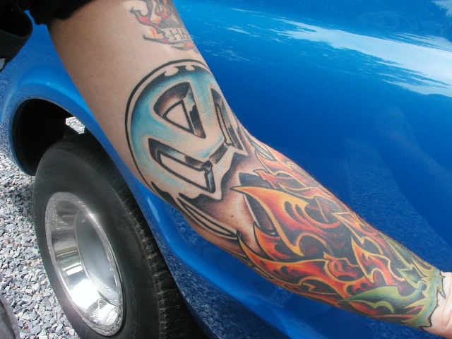
was trying to find a decent example
also, why rage about grammar on an internet forum… i dont think anyone cares.
Actually I think a lot of people do care, me for one, I find it really difficult to understand text talk and crappy punctuation. Normally I don’t even finish reading the post. So saying, i don’t usually comment as I do know that some people are dyslexic. We can all make spelling mistakes and typo errors but intentional bad grammar is just a pain in the backside!
its the internet not high school let him type how he wants to type
I would definately get it re done as well. If you color it all in, you could salvage it and make it look more crisp. If it were me, I would get it filled in with black or make it into a negative type of image which could do the same as filling it in. I take that back, I would definately go with a negative image with it. good luck
You definatley need to go to a better artist the lines are differnet size and not all them are nice and straight. Take time out to find a good artist and touch it up. Now personally i wouldn’t add flames, actually that thought wouldn’t even cross my mind. Your honering a car company don’t turn it into something it’s not suppose to be.(yet again this is all my opinion)
Cheers
Marcus
Okay, I’ve got an idea for you taken from Element skateboarding except you could use the names of say there different types of classic vehicles: jetta, passat etc. I’d say red would look the best as far as lettering as you can see in the picture. Maybe even throw in the year VW was introduced to the world.

The benefit of a the ‘negative image idea’ is that you can ditch the swirling swastika! (if you wanted to of course) as it could be covered over with the solid colouring you would use.
nah i wanna keep that.
its the original vw logo
so i want it there
i would probably go for a nice b/g shading in the background and colour the badge in like chrome effect, just to make it look like a badge from a vehicle and the shading to lift it out and pop nicely 😀
You must be logged in to create new topics.
