Following quite a negative response to my thread and pics here http://www.thetattooforum.com/finally-finished-my-arm-t16245.html I’m curious, what would you do to improve it? Maybe you don’t think it is improvable and the whole concept is rubbish? Maybe there is someone else out there bar myself that actually likes it? 😀
For the record I like my arm, it’s different, is well done and is filled with all the meaning I wanted it to have. I am just curious to see what others would do to it to change it.
Here are the pics again for those too lazy to click the link :D;
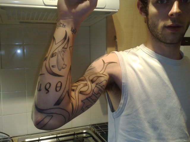
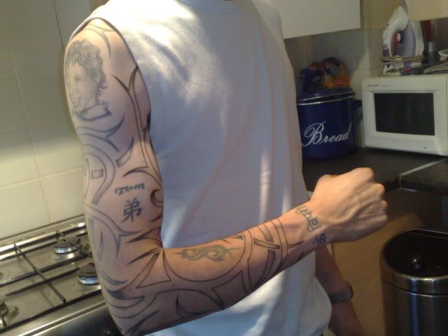
I like the basic structure of your tatt, but looks a bit spaced apart, would look awesome with some backround like an underlying image. Some uniformity of the shading would look better though.
yeah something to tie it all together would be cool.
Got anything in mind? In or around the tribal?
I would fill in the tribal and put something under/behind it. You have a lot of blank space going on, and I think that’s why it looks so unfinished.
I would personally throw some flowers behind them, but you have quite a bit of space, so the options are open.
I would personally throw some flowers behind them, but you have quite a bit of space, so the options are open.
Fill as in solid black or shading throughout?
It would depend on what went into the background. For example, if you had some bright flowers back there, I would say fill it in all black so there would be the contrast.
Maybe even get something going on inside of the tribal, some cool swirls or something.
Tribal is for noobs.
No matter how “creative” you think you’re being with your “totally not trendy” concept of tribal.
Personally…
I’d just fill the tribal in.
Might as well go for the fully generic version that (somehow/impossibly) looks better.
And for filling in the rest…I’m no artist…
But I would assume you’re going to need some detailed pieces with a lot of rounded edges and consistent shading (as in no skin color) so that it doesn’t blend in completely with your toddler tribal.
I’d go with color for the fill, personally…
Ah, such a lovely comment. 😀
Good job I’m not one to take offense huh 😉
i like it, though i would go for more shading… a lot more
Thanks mate. At least someone likes my idea, even if it is only a little. 🙂
Personally, I would suggest getting the tribal filled in with skulls and flames. You have enough blank space there, that you really should do something. Done right a skull and flames fill would look sick. Be prepared though, for anything more than solid black “tribal?” fill, you are looking at multiple sessions and a big price tag.
I would black the initial design and darken the existing ones. Back it with fauna and flora, have a few leaves and petals over lapping the initial design here and there so it looks a little intertwined. Lots of greens, some bright colours. Dont intrude on the existing tattoos too much, leave some white space around the existing ones as the initial design wraps around them nicely.
This will give it a nice balance, good contrast and overall pleasing to the eyes.
It may work with straight B&G if your not a big fan of colour.
Only a professional would pull this one off, so choose your artist carefully.
Just my 2 cents…
Dude, A couple of thoughts.
1) If you are happy with it then why consider changing? I only point this out as we can be a bunch of dicks on this site so if you like it and are happy why put it out there for suggestions..
2) gnarly is right, it looks unfinished because it’s so spread out with no shading. What can you do about this? Well, the first is to run with everyone’s idea of shading it in. I also like the idea of a background image. Something that pops into mind based on some other work that I have seen is to do a giant image- a large tiki statue that will take up your entire arm and have the tribal and whatever else you have overlap it. Basically, a very large, single image that sits behind what you already have. The spacing would work in your favor on this because there’s enough room to make the image pop and it would tie everything together.
3)We really don’t like tribal here, in general, because we’ve seen so much of it. It’s good that you don’t take it personally and in your real life it will be more accepted. Just don’t expect us to do backflips over your tribal idea- we’ve seen it all before.
You must be logged in to create new topics.
