Hello,
So maybe I am being a bit of a perfectionist, but I keep
seeing elements I need to improve on my tattoos.
I have already done a touch up once on them and it is a
great improvement. Any feedback on how to improve to them or touch up would be
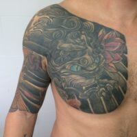
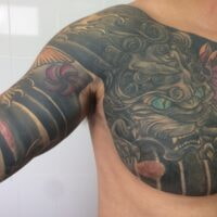
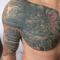
greatly appreciated. Three areas of concern:
<span style=”font: 7pt ‘Times New Roman’; margin: 0px; font-size-adjust: none; font-stretch: normal;”>
</span>-straight line along my collar bone: I feel this doesn’t look good and isn’t very “Japanese” as I haven’t
seen it before, the Japanese art tends to be more “wavy” and flowy”. How would
you suggest I fix this? What could be added to it to improve it?
<span style=”font: 7pt ‘Times New Roman’; margin: 0px; font-size-adjust: none; font-stretch: normal;”>
</span>-Area with Japanese Crest, near the arm pit, on the upper bicep. I feel the same “flowy”/”wave approach is needed here. I don’t like how it is finished off.
<span style=”font: 7pt ‘Times New Roman’; margin: 0px; font-size-adjust: none; font-stretch: normal;”>
</span>-The foo dogs claws?
Thanks.
I look forward to your response.
Alternatively I could try and laser the parts I am not happy with?
You must be logged in to create new topics.
