<p style=”text-align: left;”>Hi!
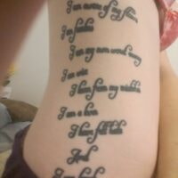
<p style=”text-align: left;”>Ok, so I got 12 lines of handwritten lettering on my ribs about a year and a half ago. The problem is that when I first had it done, it was bleeding together a little bit because of how thick the actual letters are. Then, I lost about 25lbs. ?. So now, it’s not illegible, per se, but if someone is far away, they definitely can’t read it and even if you’re close up, it’s a bit difficult to read.
<p style=”text-align: left;”>I’m so disappointed, and upset about it and I’m wondering if anyone has any ideas about a way to fix it without covering it up. I still want the words there, but I also want them to be readable to other people.
<p style=”text-align: left;”>I was thinking that maybe a little bit of white outline in certain spots on the letters could pull them apart a bit?
<p style=”text-align: left;”>If anyone has any ideas about how to make this better without a cover-up, please, please, please let me know what you think. Any suggestions would be so greatly appreciated!!!
<p style=”text-align: left;”>Thanks guys!
Could you post up a picture of how it looks now?
Absolutely! I apologize for the pics, but I had to take them myself and it was a bit challenging. Thank you so much for this! I hope these links work, but just in case, I have a “gallery” on here, where there are 4 pics of the tatt. Here are the links, I guess lol.
,
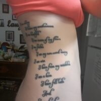
As you can see, it’s very difficult to read if you’re not close up. ?. So sad.
White can go over black in some cases but its not always great.
It might be worth going to your artist and letting them know your thoughts. see if they ahve any ideas.
In this case its the font that caused the issue really. it looks very closely written and with that font used its now not visible from a distance.
The other optioin is to rework the whole tattoo and try to find a solution in the form of a cover up. might be able to work the writing into a bigger piece and make it stand out more.
Find a great artist and see what they can advise.
You must be logged in to create new topics.
